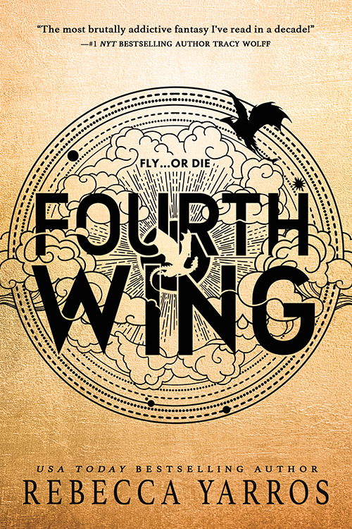
I glanced down at my phone and Oh. My. God. The cover. Jesus it’s just sitting there, right on the internet, for anyone to view. They don’t even have to go to a bookstore. That parchment paper background, no, that distinguished, luxurious, decadent, parchment paper background providing the contrast for those letters to POP off and basically assault my eyes with their sexy little curves. R E B E C C A. Y A R R O S. Oh, but that’s just the teaser. My gaze travels up (I can’t help it!), and I’m drawn into the emblem. The title. The designation. The truth, the truth is “Fourth Wing” isn’t enough. The designer knew it. They knew what they were doing. They knew they had to put some words on the cover for the masses. But I swear they were actually spending years, no decades! of their life figuring out exactly what would force me into a book. And it’s not fair, it’s not fair for them to make such a perfect signet, designed specifically to attract me. I hate them for doing it, but I can’t hate the symbol itself. How could I? It’s like a whole world turned into a coin. But the world can’t be contained! And just so, the world escapes the bonds, and the clouds exist beyond the boundary, doing as clouds do, providing a place for dragons. Not one. Two! One dark, one bright. Both for me. Just for me.
